here are some of the test covers i created before i knew the name of her EP/what she really wanted:
 |
| the first one i edited. now that i look at it i think it feels very cheesy and i'm glad we didn't use it. |
 |
| with a bar across the bottom |
 |
| my personal favorite, hence the indecisiveness with the color |
 |
| i really liked the reddish color in contrast with the b&w |
she ended up liking the bar idea a lot (#2), so we sat down together and i asked her what sort of vibe/theme went with this EP. she said it was sort of fun and cute. then we found an outtake of the shoot we did that day:
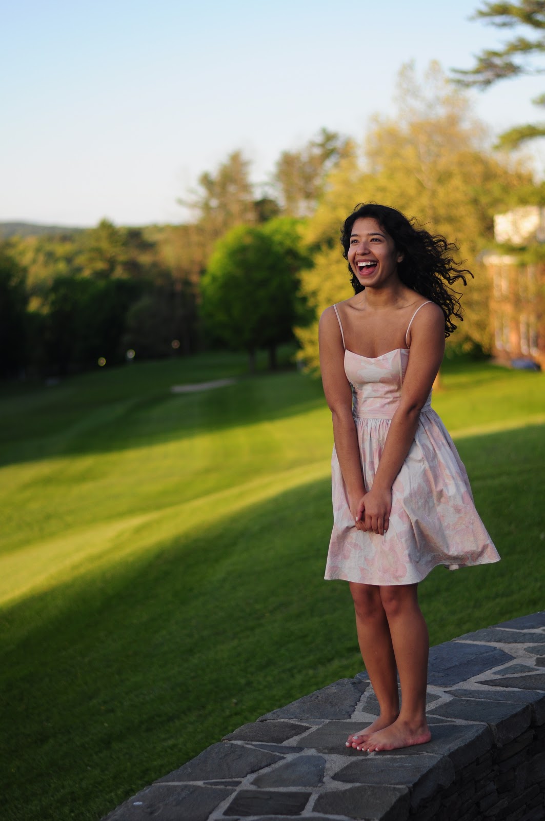
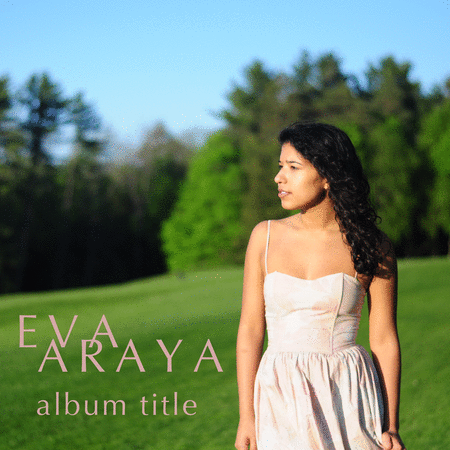
so i turned it into this:

then we did some more research on other covers and then changed it around a bit till i got this:

and that, ladies and gents, is eva's new EP cover. (also don't ask me why it's not 'the too young' on the actual cover. i thought it was called just 'too young EP' and when i figured it out i offered to change it but she said it was fine.)
the font i used was trajan pro, and the program i worked with was photoshop CS4.
No comments:
Post a Comment